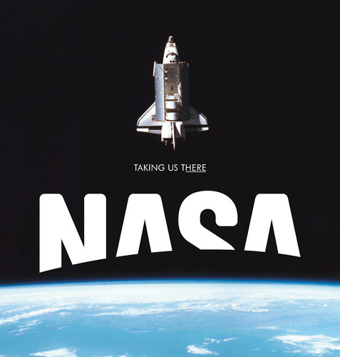
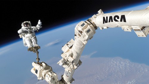
The NASA logo that never was.
by David Ng
“In 2010, design firm Base reimagined the NASA logo for Viewpoint magazine. Rather than Jetsons flourish or ’80s futurism, the team wanted to propose a new look for a post–Cold War era and gesture toward the future.”
“The NASA logo of today–the “meatball”–is actually the organization’s original. It’s pure ’60s space-race fodder, and it’s served as the casual face of NASA since 1959, save for a two-decade stint when the “worm” logo replaced it”
“Sadly, NASA passed on the logo. “They politely replied they were ‘not looking to revise their identity at this time,'”
By Mark Wilson, from Fast Company.


