For Font Lovers: A Short History of Clarendon.
by David Ng
By DAVID NG

wiki entry | thesis essay from Mitja Miklavcic, 2006 (pdf)
So, it seems that having a name like popperfont, suggests the need to discuss typeset. This, I think, is a reasonable request, and one that I’m game to explore. Note, that I know very little about the jargon and history behind such matters, but I do enjoy a good font.
– – –
O.K… so this font (which happens to be one of my favourites), has an interesting history. First up, if you want all the gory details, the pdf linked to above makes interesting reading – it’s a dissertation paper on the Clarendon font, detailing its history. This post, if anything, is a layman treatment of the paper.
Anyway, the Clarendon font appears to have started off as a design exercise to create a font that could highlight text within normal type. Apparently, until a certain point in history, this was almost always done by using italics, and Clarendon is nominally associated as the first “related” bold face – as in it was designed to look nice along with standard Times fonts.
Although, there were other typefaces with a similar “look” appearing at earlier dates, the Clarendon font seems to be most appropriately associated with an origin date of 1845, and by a Robert Besley of Fann St. Foundary. Although, from general internet perusal, the circumstances are a little vague, it would appear that Besley went on to gain further fame in later years as a Mayor of London (here is what he looked like, but if you visit the link and check out the other images, you’ll also see him immortalized in cartoon form).
Anyway, he even went on to patent the font, although this particular hold lasted for only 3 years. But during this short time frame, the Clarendon font became very popular, and once the property hold was released, many a copycat font were produced much to the chagrin of Besley himself (see below image, 1852).

It’s also interesting to note that this particular font entered pop-culture history in terms of the type of font used in in certain noted environments. One being the wild western in North America (i.e. “wanted” or “reward” signs), and other, where Clarendon variants (specifically “French Clarendon“) took on a circus look (it’s even known as “Circus Letters” in some texts).

Anyway, it wasn’t until the 1920s when Clarendon, once again, experienced a resurgence of sorts, and like before, this was primarily due to pragmatic reasons. You see, at this point in history, newspaper production rocketed to new heights, and as a result, the printing technology became a lot more efficient as well as a lot faster and rigorous. However, a downside to this, was the fact that many of the type sets used were taking a physical beating resulting in the plates being damaged (especially when the lines were especially thin).
Consequently, a number of companies attempted to produce new fonts that would still look good, but could also function in the wear and tear realities of the new printing demands. Here, the Clarendon font stepped in.
“One of the first companies that began to experiment in this way was Mergenthaler Linotype Company. After four trials they finally issued a typeface that was based on a clarendon/ionic model from the 1850s. The name of the typeface was Ionic No. 5…. The typeface was very successful…”Within a year, the typeface had been adopted by some 3,000 newspapers all over the world.” (Miklavcic, 2006)”
Finally, Clarendon-like fonts experienced another boost during the 1950’s. This, just after the World War 2, coincided with a general increase in advertisement productions (the economic boom right after the war). Typography as a whole was caught in an intensive move to design new and innovative typefaces.
Anyway, this led to a large number of fonts which many feel fit within the Clarendon look. Including the current incarnation of the font, which was revised by Hermann Eidenbenz in 1953.
So, there you have it – it’s funny, but it’s almost like these fonts “evolve” over time. There’s got to be a good analogy there somewhere…

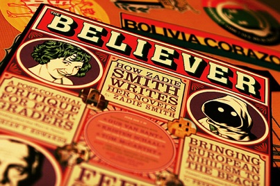
The Believer, one of my favourite magazines seems to appreciate the Clarendon look – image by Gabo/Quadrupede’s

[…] For Font Lovers: A Short History of Clarendon. […]
[…] For Font Lovers: A Short History of Clarendon. […]
[…] uninhibited types of this era—the sans serifs, the square serifs and clarendons, the extrabold versions of modern romans—coupled with the more exuberant forms such as the […]